Wednesday 29 September 2010

Uni-Ball Kuru Toga


I've not got much time to blog just now but I wanted to post quickly about my new mechanical pencil, a Uni-Ball Kuru Toga which I got recently from Cult Pens. (More technical info about this pencil at that site, but also here and here.) This one is finished in a smart azure blue (one of seven colours Cult Pens sell). I haven't used a mechanical pencil for some time - my Pentel P205 is gathering dust - but this may make me change my mind. The lead is good and dark, even for a 0.5mm width, and the proprietary mechanism inside prevents it from becoming chisel-shaped because it rotates the lead 9° with every contact with the paper. I used this to take notes during a conference with our auditors last week and it worked reliably and of course, never needed sharpening, just an occasional press of the button to advance the lead. I've also been using it in the office to take the copious notes I often have to write.

The Kuru Toga's rotating lead mechanism is, of course, this pencil's main selling point and they display it for all to see under a transparent window section so you can watch it turn as you write. I'm not so convinced by this, and would rather have a sleek, all-blue barrel, but that is a minor point. Eventually other lead widths should become available, but I understand that there are engineering issues to overcome before a 0.7mm model comes out, but if one does I will certainly get one. It would be wonderful to see a 0.9mm and a 0.3mm to complement the 0.5mm.

I don't think this will replace any of my wood-cased pencils as I like them too much, but for pencil writing on the move, this seems to be a fine candidate, and at the price Uni-Ball wants for it in the UK, it is a bargain. The price at Cult Pens is £5.60 and even my local stationers' has this for £5.99. Buy the whole collection - I may well do myself.

Sunday 26 September 2010

Tombow Mono 100 HB and Faber-Castell 9008 Steno 2B

I was asked in the comments to the Faber-Castell Grip 2001 to write a review of these two in tandem, because, although they are made for different jobs, they both leave a similar mark on paper. Before I start, though, I must express my thanks to Matthias Meckel who sent me the pencils in this review.

These two need little introduction to those who enjoy fine pencils, but just in case you don’t know about them, here’s a bit of background information. The Tombow Mono 100 is a top-quality drafting pencil (it even says so, on the side). It is reputed to be a favourite of animators and manga artists. The Faber-Castell 9008, in contrast, has a much more quotidian purpose: it is a stenographer’s pencil, designed for writing shorthand. It is one of the few high-quality round-section pencils made today, but for how much longer is anyone’s guess as shorthand writing has fewer practitioners now. I lamented the lack of round-section pencils recently in this post but I’ll repeat myself here. There must be many users who find the conventional hexagonal or triangular section pencil uncomfortable to use for long spells, so why the major manufacturers do not market round pencils more, is a mystery to me.


Before discussing the performance of these pencils I want to mention their physical characteristics. The Mono is supplied unsharpened, and is painted in a gorgeous, glossy black lacquer. It is topped off with a black endcap with a white line in the centre. All the lettering is gold-blocked, and is a riot of typography with various fonts shouting Engrish statements in addition to the essential information. It also has an outline picture of a dragonfly, after which the company is named. The dreaded barcode is printed on this one though I have another Mono 100 on which the barcode was applied as a sticker. The 9008 is painted in Faber-Castell’s trademark dark green lacquer with a silver band at the end. Gold block lettering with the country of origin, model number, manufacturer, the word “STENO” and the name “CASTELL” are printed. 180° away is printed the grade of the lead and, presumably to reinforce Faber-Castell’s environmentally-friendly credentials, the German word “Wasserlack” (water-based paint). I should note that I was so impressed with the 9008s Matthias sent me that I bought some more , in B grade. Clearly, the two versions of the 9008 I have were made in different batches as the 2Bs have all gold lettering, whilst the Bs have the reverse lettering printed in primrose yellow. There is also a slight difference in the green paint: the 2B is darker than the B.

In use, the pencils are remarkably similar. Both leave lovely, dark lines on the page. The 9008 is perhaps slightly darker: not surprising, considering this pencil is two grades softer than the Mono. The Mono 100 is slightly smoother on paper, but really not by much; it glides along as though lubricated by a coat of oil, and though the 9008 has a bit more tooth, it could never be described as scratchy. When writing, I found that neither pencil required much pressure to write darkly.

Given that the lines left are dark enough for anyone’s purposes, any differences really come down to how the pencils feel in the hand. For me, there is no contest: the 9008 is the hands-down winner. Why? The circular section is simply far more comfortable in my hand than the hexagonal Mono 100. Indeed, I found the edges of the Mono to be sharper than other hexagonal pencils I own, such as the Staedtler Mars Lumograph. I suppose this is due to the lacquer Tombow use; on the Mars, the edges are softer, probably a product of the number of layers of paint used. A close examination of the Mono 100 does not show any sign of woodgrain, so the lacquer must be fairly thick. I can only surmise that it is the way in which Tombow applies the lacquer on the pencil: fewer layers, but denser paint (and most definitely not “Wasserlack”). Whatever the paint used, I found that the Mono 100 dug into my fingers after a short period of time. The 9008, by contrast, was a joy to use because, with no corners or edges, my fingers would mould themselves around the pencil’s barrel.

Both pencils are excellent, either for writing or for drawing. I have found my favourite pencil so far in the 9008, but the Mono 100 is not far behind, and I’ll use the Mono for astronomical sketches.

Monday 20 September 2010

New design

I have changed the design of the blog, becuase I wasn't entirely happy with the dark grey background it had. It's only one of the Blogger templates; I hope the bookshelf wallpaper is not too obtrusive.

The design is likely to change again if and when I become bored with this template.

KUM Long Point Sharpener


I recently bought a KUM long-point sharpener from Cult Pens, but I've had very mixed results using it. Some pencils sharpen well - such as the Staedtler tradition HB - but others break leads almost as soon as I turn the pencil. For example, the Faber-Castell 9008 Steno kept breaking.

I'm still new to this game so it may well be my own fault for being too rough or turning the pencils with too much force. On this design there seems to be a lot of pressure at the narrow end, more so than a conventional sharpener.

If any readers have tips on using this stenographer's sharpener, please let me know.

Saturday 18 September 2010

Faber-Castell Grip 2001


For my next review, I thought I would try a competitor to the Staedtler tradition: the Faber-Castell Grip 2001. This pencil is widely available here in England, and is marketed as a high-quality pencil which is produced in two variants: one with an eraser, and one without. This blurb from Cult Pens gives an idea of the market for this design:

The Faber-Castell Grip 2001 series is a traditional wood-case pencil redesig

ned for the 21st century. Winner of numerous design awards, the patented soft-grip zone provides a secure, non-slip grip, while the ergonomic triangular shape aids tireless writing and drawing.

The eraser-tipped version costs 99 pence in my local WHSmith’s, an

d the non-eraser version (the more common of the two) costs 89 pence, which is about half as much again as the Staedtler tradition. My local WHSmith sells this pencil only in HB, though a quick check on Cult Pens shows it to be available in up to five grades: 2B, B, HB, H and 2H. This suggests to me that the Grip is really optimised for writing, rather than drawing.

The Grip is a striking-looking pencil. For one thing it has a triangular section, not hexagonal, is finished in a smart silver-grey matte lacquer, and sports 26 rows of raised dots painted on in black along each side of the barrel. Their purpose is to provide a non-slip surface for the user. On the non-eraser version I used, the end-cap is painted in a gloss gull-grey. The shade of the end-cap varies from black for the 2B to a light grey for the 2H. The lettering (which occupies only two sides of the pencil) is crisp and the barcode is tastefully printed and unobtrusive. The eraser variant sports a ferrule and eraser in black, to match the lettering.

The wood used is not cedar, but I am not sure what it could be. It has a pronounced grain with easily visible pores, and there is no odour from it. In my KUM sharpener it sliced the wood very easily.

I used this pencil exclusively for a few days, and my overall impression is that this is indeed a quality pencil for writing. The HB lead is lighter in colour than Staedtler’s, and requires sharpening less frequently. For example, during a two-hour meeting at work I wrote some five sides of notes and needed to sharpen the Grip only once. The point stays sharp longer, and even when it has worn down it still lays down a good, legible line. It is not so prone to smearing as the Staedtler HB, nor to breaking; using my KUM sharpener I could get a very sharp point which would not yield under moderate writing pressure. Even when the point has worn down, and provided I did not press too much into the paper, it would leave a thicker, though still silvery, line. F-C’s HB standard is harder than Staedtler’s, for example. I would estimate that F-C’s HB is at least one if not two grades harder than Staedtler’s so the HB on a Grip 2001 would equate to a Staedtler H.

The triangular grip is reasonably comfortable, but I am not sure it is any more so than a traditional hexagonal pencil. However the main problem I experienced using the Grip was that the raised dots would dig into my fingers, so that after a fairly short period of time I would feel some discomfort in my writing hand where the pencil rests on my middle finger. This is not a problem for writing notes but for extended periods I think it would be. To be honest the Grip idea seems to me to be a gimmick, a way of differentiating this design of pencil from its competitors. I do not have a problem with slippery pencils, but I find the Grip to be uncomfortable after a while.

Furthermore I wonder if Faber-Castell has practical difficulties manufacturing this model. Close inspection of the few Grip pencils I have, shows the dots to be unevenly applied. Some are rounder and more pronounced than others, whilst some are not even full circles, but have a slice taken out of one side.


But any gripes I may have are very minor. Overall this is a high quality pencil – and a very modern one, too. It is not a favourite of mine because of the comfort issue which I mentioned above, which is odd considering that this pencil is marketed as one which can be used for long periods. Its price puts it almost in the premium pencil class – nearly as much as the Mars Lumograph, for example, or F-C’s own 9000 series. I don’t think it’s quite as good as that and I would rather use a 9000, but this is still a very nice pencil for the money and well worth trying.

Monday 13 September 2010

Stationery Archaeology 1


This is the first in an occasional series on old bits of stationery I find on my travels: number one, a Faber-Castell eraser which I found whilst clearing stuff out of the loft.

Friday 10 September 2010

Bleistift

Thanks to Matthias from Bleistift for linking here.


And welcome to new readers to this new(ish) blog.

Cahiers

One of my hobbies is astronomy. It's been an interest of mine since I was eleven years old, on and off. For some time I've been making observations of variable stars for the British Astronomical Association's Variable Star Section. If you don't know what a variable star is, here's a link to Wikipedia which gives the basics.


For a few years now I've used a Moleskine Cahier notebook to record my observations and now, finally, I've run out of space. I have already started the replacement, this time a Clairefontaine notebook with much nicer paper and a slightly bigger size. I've also changed pens: after using a Uni-Ball rollerball pen I bought a green Pilot 78G to use with the Cahier. Then I found the Pilot V-Pen (known as the Varsity in the US) which I emptied out of the original mint-green ink and replaced with black ink. Now, with a new notebook I have redeployed my Pilot Capless and filled it with the same black ink.


Although I have changed pens, I've not changed ink. I use Noodler's Bulletproof Black to record my observations, and at the rate I use this ink, my 3oz. bottle should last me years. I use bulletproof ink for its permanence; these observations probably are the only things I write which are worthy of preserving for the future, even though I have to write them subsequently on an Excel spreadsheet before they go into the BAA's database which starts in 1890. I also use it because of its waterproof quality as the nights can get quite damp here in England. But this is the only use I have for bulletproof ink; most of the time I use blue Quink or a pencil, even though, like many fountain pen users, I own a glut of ink in various colours from a wide variety of manufacturers.


Looking through the log, I see I started this notebook back in 2007. It doesn't have my earliest variable star observations, those are in another Moleskine I bought when I worked in London in 2005 (pictured, with the natty Duck Tape binding).


I own a few Moleskines, but I don't buy them now. I admit, I was taken in by the hype and the marketing ("the notebook of Picasso, Hemingway and Chatwin") but this was before I rediscovered fountain pens, and the fact that fountain pen ink bleeds like mad on the trademark yellowish Mole paper. The quality of the paper used is a constant source of angst on the Fountain Pen Network; I eventually found a nice replacement in the Clairefontaine, which I can buy locally too. Sometimes I wonder what Picasso or Hemingway would make of today's Moleskine notebooks. Would they complain about the quality of the paper or the fragile binding? Were they really that fussy about their paper or notebooks?

I've still got a few pages in the Duck Tape Moleskine but soon that will be history too. I also own a large plain Mole which has only a few pages filled in. I bought that to make sketches in but found the paper too thin, even for pencil sketches. Finally I have a small ruled Moleskine which serves as my general-purpose notebook and in which I write all kinds of things. When both notebooks are finished it's highly unlikely I'll buy Moleskines to replace them, however.


On the subject of Clairefontaine, I have several of their cahiers and an A5 pad of their drawing paper. Here's a picture of my new variable star logbook, this orange one being a handy size, with a cheerful colour (not that I can see it in the dark). The paper inside is superb: smooth and white, nicely-printed feint lines, no feathering, no bleedthrough. Couple that with a top-quality pen and ink, and the mundane business of recording a scientifc observation becomes a pleasure in itself.

Wednesday 8 September 2010

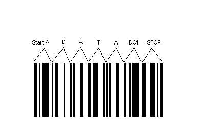
Barcodes


Reading around the pencil blogosphere it seems that some consider a printed barcode on the pencil's barrel to be alien to the character of the pencil. Here's an example of a pencil review where the reviewer has welcomed one manufactuer's efforts to avoid printing a barcode on the side. In that case, the manufactuer, Caran d'Ache, has resorted to a removeable plastic sleeve with the barcode printed on it. This seems to me to be an elegant solution, though probably a relatively expensive one. Others have tried to use a sticker - Tombow comes to mind here - but too often that leaves a sticky residue on the pencil once the sticker has been peeled off, which is unpleasant to use.

Whilst it is nice to see a clean, clutter-free design on a pencil, I do like to see the various pieces of information the manufacturer has put on it. Whether the manufacturer's name and trademarks, country of origin, a model number, the grade of the lead, those mysterious little codes embossed in the side but not painted, and indeed the barcode, they all add to the character of the pencil.

The problem of fixing a barcode to a pencil so that it can be scanned at a shop's till really has only one foolproof solution - print it on the side of the pencil itself so it cannot be peeled or picked off. This is what Staedtler and Faber-Castell do. I don't think they detract at all from the character of the pencil, and those manufacturers make them as discreet as possible anyway. I am sure that in future, if the pencils produced now are collected or used by pencil lovers, they will appreciate these symbols of our industrial society. Here's to the barcode.

Monday 6 September 2010

Staedtler tradition HB


I thought that I would begin the reviews with an unsung hero of the pencil world, a pencil which, if not quite ubiquitous here in the UK, is probably the most widely-available: the Staedtler tradition HB.

This pencil - at least in its 110 form without an eraser on the end - is pretty much the benchmark in the UK today. (The 112 model which has the eraser at the back, is less commonly seen though recently I bought one in Ryman's.)

Many other pencils are deemed to be higher quality but those aren't often found in your local newsagent's, or stationer's. These cost around 60 pence each (about $1). The closest competitor is the Faber Castell Grip 2001 I suppose, though the tradition is more common. I will get around to reviewing the Grip some time soon.

The tradition is available in 14 grades - from 6B to 6H - though the HB grade is by far the most common, and is used for both drawing and writing. I use it only for writing.

The HB lead is fairly soft and leaves a nice, dark line when pressed hard into the paper. Even when less pressure is used, the line is dark enough to read easily, even when it is sharpened to a fine point. The price paid for this is of course fairly frequent sharpening, and I found I needed to resharpen the tradition once every page or so in my A4 notebook. The lead sharpens up easily, though it will break very easily if you use a lot of pressure. Sharpening is also helped by the quality wood used, which appears to be Californian cedar (though I am no expert on this) which has a tight grain and a pleasant aroma.

After three days in the office using this pencil exclusively to take notes and write messages, I learned to use less pressure and to rotate the barrel of the pencil as I wrote, to keep a smooth even line. It erases very easily with a Stabilo white eraser. Being on the soft side, the lead is prone to smearing, which I found when I leant on my notepad.


Appearance-wise, the tradition is finished in the familiar Staedtler red and black stripes, with gold foil-blocked letters which read:

MADE IN GERMANY STAEDTLER tradition HB

The other side has a barcode and some inventory data on it - sorry, I forgot to take a picture. These are printed on and the barcode is already showing signs of wearing off. Many bemoan the presence of barcodes on contemporary pencils, but I quite like them; if the barcode had been invented fifty or 100 years ago I am sure they would be present on the pencils of yore and today collectors would be proud of them. In the future, the barcodes on today's pencils will be treasured as a feature.The finish is smartly done, with clean demarcations between the stripes. One thing I noticed on the rear end of the pencil however, is that the red and black lacquer show through the white lacquer on this current pencil. Perhaps Staedtler have changed the formulation of the paint? I have some old traditions and a couple of Noris which were made in Great Britain, where the white paint is opaque, not translucent. The lacquer used now is probably less toxic, but I would not know. Anyway, here's a close-up, with the white paint showing a distinct pink tinge:


Production of the tradition has since ceased in Great Britain and Australia, and now it appears to be made only in Germany. Here is an excellent review done by memm on the Bleistift blog which compares traditions made in Germany, GB and Australia. Certainly on the older, made-in-GB pencils I have, the lacquer and overall finish seem to be superior to the pencils of today. I suppose this is due to there being a bit less gold lettering, thinner coats and environmentally-friendly paints used in the finishing. The lead seems to be the same high quality, and the wood on this pencil is as good as the older models.

So, do not overlook the Staedtler tradition HB pencil. It is a fine pencil for the money and should be in everyone's pencil case.

Wednesday 1 September 2010

Back to School

1 September is traditionally the start of the new academic year here in England, and indeed today was the first day of school for my children - or it would have been, had the schools concerned not been closed to enable the teachers to receive some professional development. 2 September is the de facto start of term. The shops are full of "Back to School" promotions; Stabilo seem to be doing well with getting their new products in the stores.

I've had a minor splurge on pencils, mostly for my children but also for myself, which I intend to turn into reviews soon. I'm conscious that after a week online, I have yet to produce any reviews, or pictures, only my ramblings on stationery matters. I promise that will change shortly. I return to work tomorrow and intend to post some review-type articles as I do most of my writing at work.